Indie Publishing
Field Notes

We love sharing our process of making a print magazine and building a sustainable indie publishing brand. New here? Start with our list of popular posts.

Production

How I personalise Offscreen’s launch newsletter

Posted on Jul 19 2017 in Production

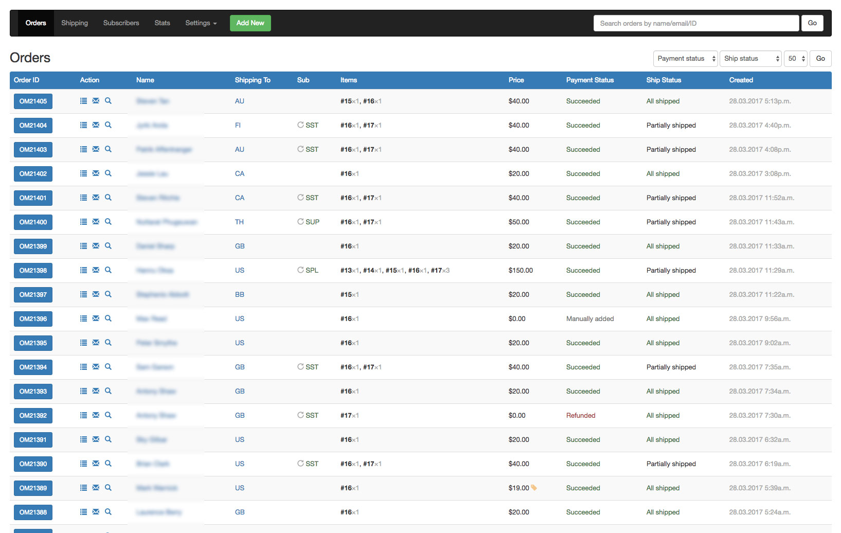
Email is a medium most of us had written off when social media came around. Yet, as a small business owner there is not a more powerful marketing tool than a well-maintained newsletter list. I'm an avid Twitter user too and I do get a lot of referrals from re/tweets, but it pales in comparison to the visits, sales, and replies I get from email campaigns. (By the way, Facebook as a promotional tool is completely useless unless you are willing to turn your messages into paid ads which, in my opinion, always feels a bit disingenuous.)

For the launch of issue 17 I sent out an email to the ~10,500 people on my 'Offscreen Updates' list. This list is separate from my weekly Dispatch list and I usually only email subscribers of that list once or twice in between issues to inform them about the status of the next issue. If you have ordered anything from the Offscreen website in the past, you've been added to that list automatically. As such, this list consists of current and past customers – some are just following along passively, some buy issues occasionally, some are active subscribers of the magazine.

Four months in between issues is a long time to remember what you last ordered, so I use my launch newsletter to inform everyone about their individual order or subscription status. Here's how I make that email as relevant and clear as possible...

Disclosure: I'm using MailChimp, a current Offscreen sponsor, for my newsletters. It's possible to achieve similar outcomes with all major email marketing providers. This post was not commissioned or paid for by MailChimp.

Adding merge tags to the subscriber list

My custom order management system is connected to MailChimp via their API. This allows me to sync the following data about each customer to my MailChimp list:

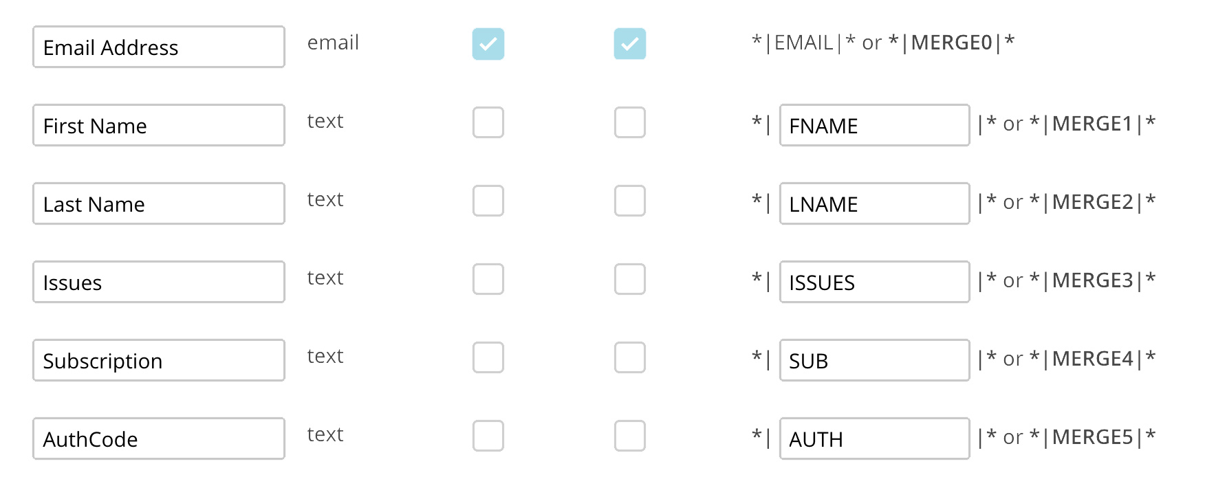
Besides the obvious ones, like email and name, I also sync the number of the issues they bought (ISSUES), the type of subscription they have (SUB) and an authorisation code (AUTH). The auth-code is a string of numbers and letters unique to each customer. I use this auth-code to enable existing customers to log into their Offscreen account, but I can also use this code to send them to the Offscreen checkout page with their shipping details pre-filled.

List segmentation

I use MailChimp's list segmentation feature in conjunction with merge tags to split the list on two major groups:

Group A: those who have already ordered issue 17.
Group B: those who have not (yet) ordered issue 17.

I then create two slightly different email campaigns for each group.

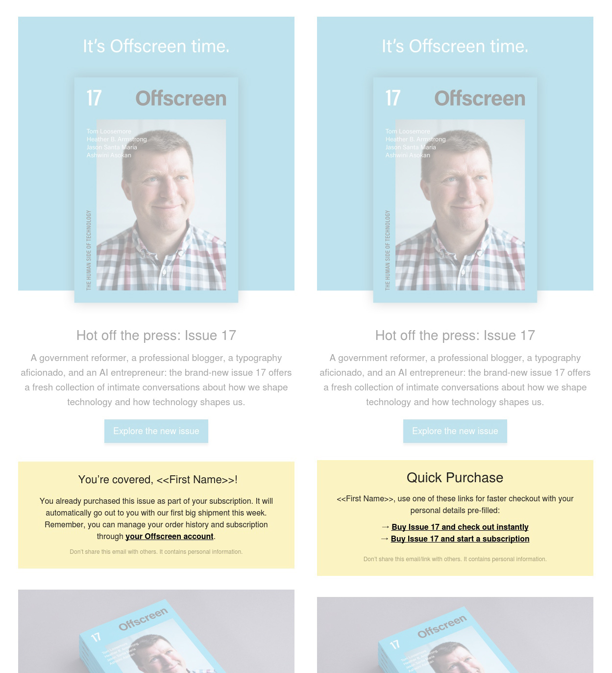
Existing customers and active subscribers to the magazine (Group A)

All customers who have already ordered and paid for issue 17 (e.g. active subscribers) receive an email that shows the following note:

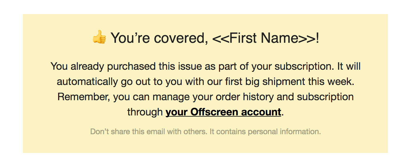
Here's where the auth-code comes in handy because I can include a link to the customer's account – no login required.

Live preview of this email

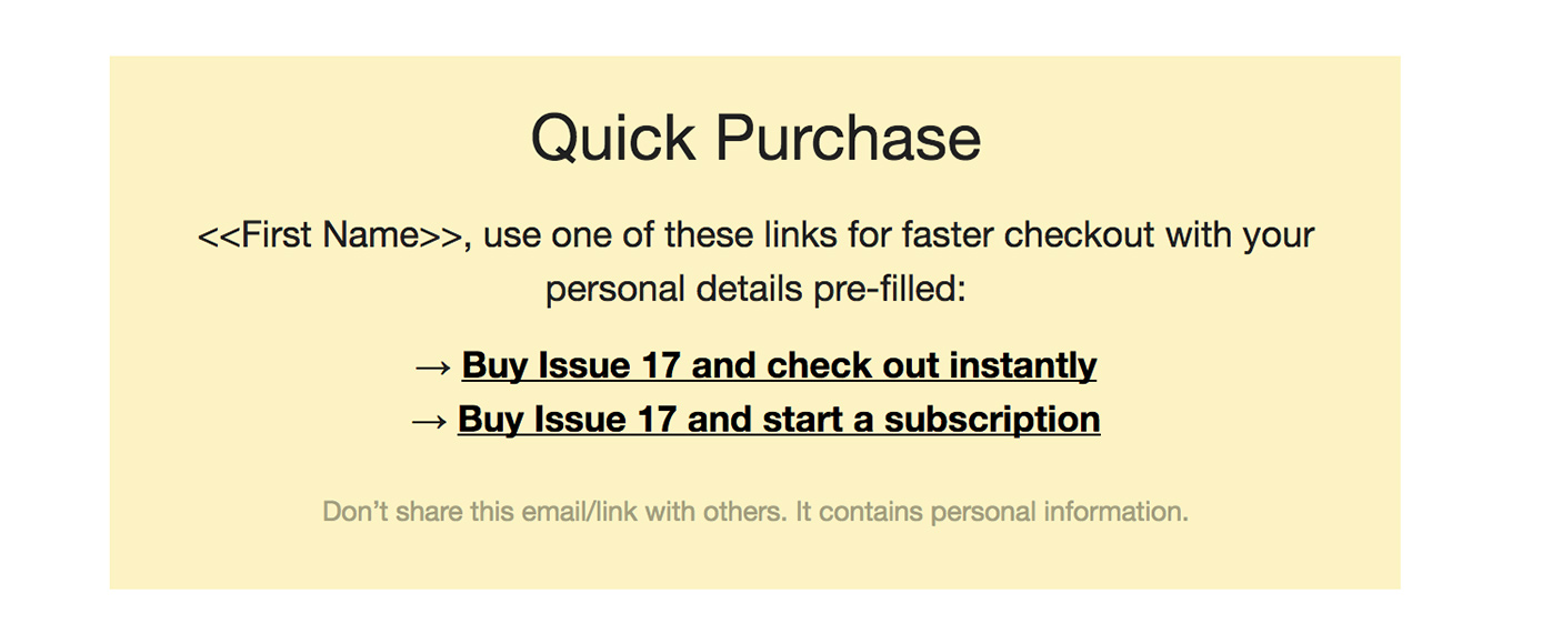
Past customers and passive newsletter subscribers (Group B)

For those who have not (yet) bought the latest issue, I display a call to action to purchase the issue and/or subscribe. I split this group into two more sub-groups: 1) those who have previously ordered something on Offscreen and have an existing auth-code, and 2) those who haven't bought anything before and are just following Offscreen as a newsletter subscriber.

All customers since our relaunch have an existing account (auth-code) and so I can add their auth-code to the checkout URL which pre-populates the order form with all their shipping details. This speeds up the checkout process – they just have to add their credit card or PayPal account credentials.

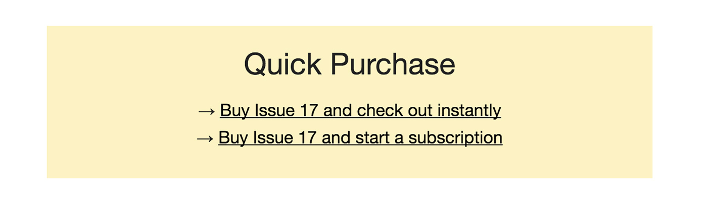
Those newsletter subscribers who haven't bought anything recently get a standard set of links without any pre-filling magic.

Live preview of this email

And that's pretty much all. I think getting a clear status update about your previous order/subscription goes a long way in regards to a great customer experience. If you know a little bit about email marketing and merge tags then the above won't seem overly fancy to you. It just requires an email list that is in sync with your customer database. If you never heard of merge tags before, here's a quick intro by MailChimp. I can highly recommend using them to make your newsletters more relevant and useful to your subscribers. Happy emailing!

New Machinery

Posted on Jun 27 2017 in Production

After five years of loyal service, I'm retiring my current Macbook Pro and replacing it with a new model. (For those interested in specs: it's the 15-inch 2.8GHz 2017 model with standard specs.) As I went through the process of buying and now setting up a new machine and talking to people about it on Twitter/Instagram, I made a few observations I wanted to share:

  • Five years is a long time for a computer. To be fair, I have had one battery and a couple of screen replacements (free through Apple Care) but given that this was my main and only machine for the better half of the last decade running for around eight hours per day on average, it's aged amazingly well. In fact, it's still going strong now. I've decided to get a new one because its battery needs replacing again and, more importantly, the CPU/GPU is struggling during heavy lifting in Indesign/Lightroom. The laptop's casing is certainly showing its age too – it's lost a couple of its rubber feet a while back. But after five years of daily operation and many thousands of kilometres of travel, I'm very impressed with the shape it's in. Apple devices aren't cheap, but their build quality is hard to beat.

  • There was a time when hardware specs got me really excited. I remember the thrill of ordering PC parts online and then putting together my very own dream machine. Twenty years later, I really don't care all that much about the inside. Hardware specs don't seem all that important anymore. It's a tool, and the less time I spend thinking about the inside, the more I can focus on getting work done. That's why I don't feel particularly strongly about the Touch Bar, the lack of ports, and the many other things that got people riled up about this release. Some of the updates will cause inconvenience for a while, but I'll adapt.

  • Some people on Twitter suggested I should look beyond Apple and check out Microsoft or even Linux alternatives. The stuff coming out of Microsoft lately looks really promising, but a move from one platform to another is way too disruptive for me. The time it takes to (re)learn Windows, find similar apps, and move things over is just not worth it for me. As I said above, computers are tools. I don't obsess about tools – I just want them to work reliably so that I can go on with my life/work. The Mac does this for me, so I don't see any major benefits in moving to another platform.

  • Those who follow me know that I don't believe in jumping on every trend or purchasing every shiny new gadget (despite publishing a weekly newsletter containing a lot of those). Our industry produces millions of tons of toxic e-waste every year. I think we shouldn't upgrade our devices just because Apple tells us to. I made it a principle to not buy new devices until they break or their age negatively impacts my productivity in a major way. The same goes for my phone.

  • I occasionally do consulting for fledgling magazine makers and one question that often comes up is what hardware setup I would suggest. The assumption is that in order to make a good print product, you need expensive, 'specced-out' Mac Pros and special screens. But the only other hardware I've been using to produce 17 issues of Offscreen is a pretty simple, non-retina 21-inch DELL screen (I think it was less than $500 when I bought it) that I attach to my laptop when I work from home. I also bought a colour-calibration device (Spyder Express from Datacolor) to ensure colours on screen aren't way off. And that's it. It's a pretty basic setup that has worked well enough for me. Now that I have the new Macbook Pro I will most likely update my screen as well to get a bit more screen real estate and make use of 4K and USB-C connectivity. I'm looking at the LG 27UD88 but haven't decided for sure yet, because... see above.

  • Environmental issues aside, upgrading the machinery I rely on every five or so years is a worthwhile investment. Sure, Apple products aren't cheap, but it's a tiny expenditure considering the value I'm able to produce with it. Spending $5000 every five years breaks down to around $83 per month or $2.75 per day. I spend more on coffee. How crazy is that?

Building a custom magazine subscription management system

Posted on Mar 31 2017 in Production

This post is an edited version of an email from September 2016 that was part of my Rebranding Diary. You can see much of what I discussed in that email live on our website now, like our multi-tier subscription model that charges readers on a per-issue basis.

Offscreen’s original order management system (OMS) has served me very well over the years. It solved a fundamental problem every magazine maker faces: managing orders for single issues and for subscriptions (which are essentially orders for future issues) in one place, while keeping customer data up-to-date and optimising orders for shipping. It connected directly with PayPal’s IPN system, which has its flaws (like everything PayPal-related) but is extremely easy and fairly flexible to run.

When we created this system almost five years ago, there were a lot fewer out-of-the-box ecommerce tools available. Today, between Shopify, Squarespace, bigCartel, and a whole host of other shopping cart apps, it begs the question why I should develop my own customer and inventory management tool.

Why not go with Shopify?

While the above mentioned apps are extremely powerful (especially Shopify with its own app store), they don’t exactly suit indie magazine makers who often publish new issues infrequently and rely heavily on subscribers to manage their cashflow. Available subscription management plugins don’t cater for this type of product either. Most subscription SaaS products either focus on digital subscription management or sell monthly subscription boxes which are completely different beasts to printed publications that come out every few months. While customising these tools is possible, they are just not meant to be used that way.

I also don’t use any of the larger fulfilment services like Shipstation or Shipwire because Offscreen is shipped through a small logistics company in Berlin. Their low handling fees combined with German Post’s low postage makes shipping Offscreen around the world possible. Going through a small service provider like that also means I don’t have any fancy APIs to work with – instead I export a weekly order sheet in the form of a CSV file and make it available to my shipper in Berlin.

When it comes to handling payments, almost none of the existing apps offer recurring, but infrequent charges. Like many other indie magazines, Offscreen doesn’t adhere to a very strict publishing cycle. I aim for a new issue every four months, but it sometimes varies by a few weeks. Many of the available SaaS products offer recurring charges such as every week, month, quarter or year, but I still haven’t come across a tool that allows me to charge customers whenever I'm ready to ship a new issue. Essentially, I’d like to store my customers’ payment information securely and then trigger a charge by the time I release a new issue.

All of this means that creating a custom plugin for Shopify would be almost as complicated and expensive as creating my own order/subscription management system. And so I chose to go with the latter because it gives me a lot more flexibility.

The ideal order and subscription management tool

So what would the ideal buying experience for readers and the ideal order management system for a publisher look like? I've been pondering that question for the last few months, if not years. Here are some of the features I’d love to use:

  • Make magazine subscriptions more like digital SaaS subscriptions
    Most indie magazine subscriptions are simple pre-orders for the next n issues, paid a year in advance. They usually don’t auto-renew which means readers have to be reminded to come back to the site to buy another one-year subscription. Rather than making a big commitment upfront, what if we let readers subscribe on a per-issue basis? Once subscribed, Offscreen charges readers a few weeks before the new issue is released. They can cancel or change tiers any time.

  • Offer different tiers of support
    So many of my readers want to support the magazine beyond just buying a copy. What if, rather than just buying a standard subscription, they could choose from a few different tiers according to the level of support they want to give? I can imagine at least three different tiers – subscriber, supporter, and patron. The higher tiers include a little gift to show my appreciation for their support. Subscribers can change tiers in between issues.

  • Integrate the patron model into subscriptions
    Offscreen patrons pay a fee to have their name included as supporters in the back of each issue. I think all small indie publications should consider having such a patronage model for their most loyal readers. Their extra contribution goes a long way in making it a sustainable publishing business. Ideally that patron model would be more deeply integrated in the checkout process so that more people can become a patron without me manually handling every single request.

  • Provide a simple account interface to manage orders/subscriptions
    I think a lot of us don’t like buying subscriptions to physical products because there is often no sense of control. You subscribe to a magazine online, pay the yearly fee, and then hope that you don’t move houses in the next twelve months. How do I change my shipping address in between issues? Do I need to renew manually? What if my credit card expires? I want Offscreen readers to feel like they are in control of their subscription through a simple account interface – ideally without having to create a login/password.

  • Offer discounts to students and libraries
    I feel strongly about supporting the next generation of techies and making Offscreen available through more public libraries. Offering EDU discounts isn’t as straightforward as it seems because it requires some sort of eligibility check during the checkout process. We’re exploring using this openly available database to check customers’ email addresses and apply an EDU discount of around 25%. (Note: we didn’t manage to release this feature with our launch, but it’s still on our to-do list.)

  • Streamline the management of all of the above
    The only reason why I’m able to run Offscreen by myself is that I streamline the admin side of things as much as possible. The ideal system is perfectly tuned to what I need to get done every day, week, month, and quarter. Creating a completely customised system allows me to avoid unnecessary steps and optimises the process between receiving an order and sending out issues.

Some of the above features are ‘experimental’ to say the least. Other publishers I spoke to said I should continue offering standard yearly subscriptions (and this new system still allows me to do that if I change my mind), but I’m eager to see whether the age-old model of magazine subscriptions can be improved through a per-issue model that behaves more like other digital subscriptions we already have.

Using Bootstrap, I quickly created all the necessary templates for the back-end so that my developer Dan Rowden can get started with development. I also spent a lot of time on a very detailed document (23 pages in Google Docs and counting) to outline all the different features, edge cases, etc. It’s been an interesting experience working through every detail of such a big project. There is so much stuff happening behind the scenes that is necessary for things to run smoothly but that nobody will ever see or even know exists.

Stitch binding for easy reading

Posted on Mar 27 2017 in Production

After a few readers asked me whether the binding of the new issue looks ‘unfinished’ on purpose, here some more background on our new, premium binding technique.

All previous issues of Offscreen use a pretty standard binding method called ‘perfect binding’. Tightly wrapped by the cover material, a thin layer of glue holds the content pages in place. ‘Perfect binding’ is not the cheapest method but it’s proven reliable and fairly straight-forward during production which is why it has become a quasi-standard for most publications.

Because the glued spine is quite rigid and usually doesn’t bend open (although you can break it if you force it) some information is lost in the centre of the spread. Depending on other factors, like the paper type, the page count, and the publication’s dimensions, it can be difficult to keep the publication open. This video by Works That Work illustrates this really well.

As you would expect, Germans have a wonderfully descriptive word for this: Klammerwirkung (the peg effect). If you own older issues of Offscreen – in particular issues 5 and 6 – you would have experienced it yourself. At the time, I changed the paper to a heavier stock which increased the Klammerwirkung and gave your hands/fingers a real workout while reading.

There are a few ways around this problem. The early issue of Works That Work in the video above uses a simple saddle-stitch binding (staples) which works well up to a certain number of pages. Then there is a fairly new binding method called Otabind which Works That Work used in later issues as the page count increased. This technique tackles some of the issues above by detaching the cover from the spine. However, depending on the total number of pages and the cover material, it can make the spine of the cover a bit wiggly and flimsy.

I’ve looked at a whole range of publications and a binding technique that stood out was the so-called Schweizer Broschur (Swiss brochure). With this technique the content pages are only attached to one side of the cover. If combined with a more expensive stitch-binding technique – a series of threads literally stitching the pages together – the Schweizer Broschur can deliver one of the best reading experiences out there. It’s also great from an editorial design perspective: because it lies completely flat I can work with the full area of each spread without the centre being swallowed up.

I can certainly understand why the exposed spine looks ‘unfinished’ to some, but it’s one of those classic ‘form follows function’ cases. The experience it provides makes up for the slightly unrefined look. Once you open the magazine and explore its contents I think you’ll notice how nice it is to be able to do so without requiring any effort at all. Eating your lunch while reading Offscreen has never been easier. 😉

Settling on Acumin, Offscreen’s new typeface

Posted on Mar 24 2017 in Production

Over the next few weeks I’ll be sharing a selection of my Rebranding Diary emails. These emails went out to backers of my fundraiser every Sunday between August 2016 and March 2017. I’ve made some updates to these emails to adapt them to the blog’s open format. First up: my decision-making process for settling on Offscreen’s new typeface, Acumin. First published on Sep 10th 2016.

Going through the editorial design inspiration that I’ve been collecting for a couple of years now, you can see that I like mainly type-driven spreads, using only a few simple elements combined with one or two (often subdued) colours. This is where the redesign of Offscreen is headed. The goal is to further reduce and simplify, to create a placid reading experience accompanied by unpolished, real-life photography. I want it to feel as calm as reading a book and as personal and authentic as going through someone’s photo album.

How can a typeface assist in that goal?

Most typefaces contain a few distinct letters that give it away quite quickly. For example, the unique shape if the lowercase ‘a’ in Calibre, the curve in Circular’s lowercase ‘t’ or that prominent crossbar of Walsheim’s capital ‘G’.

Perhaps that’s why, when I came across Acumin, it didn’t trigger any particular reaction at first. In a way, Acumin is spectacularly unspectacular. It’s a pretty ‘straight-faced’ sans-serif type with few characteristics that stand out. It doesn’t really make much of an effort to grab your attention or sell itself. [Writing this I’m realising that I’m kind of describing myself/Offscreen.]

I love going through the websites of type foundries to explore the stupendous amount of work that goes into designing typefaces. When I buy new things I’m usually rooting for the underdog, so I was eager to support smaller foundries. Acumin was commissioned by Adobe, another reason why I didn’t really pay much attention to it. Not that I dislike Adobe in any way, but as a tiny brand I know that every paying customer can make a big difference. And so after a lot of research, these were the typefaces I set out to test:

On my initial shortlist was Suisse International, Aktiv Grotesk, Atlas, and Post Grotesk. Some testing showed that Suisse and Aktiv Grotesk just ran a little too wide in body sizes. This meant that I either had to cut down on content, reduce the font size or add more pages – neither of which was an easy thing to do. Both of those typefaces can feel a bit too modern and cold. In contrast, Atlas and Post Grotesk are beautifully human and amiable, yet I simply didn’t enjoy them as text fonts. What makes them so friendly and a bit quirky gets in the way when reading long passages of texts, in my opinion.

Once I ruled out the ‘too cool’ and ‘too playful’ types, I was left with something in the middle, something quite neutral. I was looking for a less ‘trendy’ and overused version of Helvetica. This eventually led me to Neutral (duh!) and back to Acumin. Neutral is amazing, but Acumin’s much larger family was very appealing.

After devouring Acumin's wonderful microsite, I did a bit more digging and came across a post by a familiar face. Jeffrey Zeldman has high praise for Acumin. He calls it “a Helvetica for readers”. And I couldn’t agree more with his observations:

Reading about the design challenges Slimbach set himself (and met) helps you appreciate this new type system, whose virtues are initially all too easy to overlook, because Acumin so successfully avoids bringing a personality to the table. Enjoying Acumin is like developing a taste for exceptionally good water. (...)

Book designers have long had access to great serif fonts dripping with character that were ideal for setting long passages of text. Now they have a well-made sans serif that’s as sturdy yet self-effacing as a waiter at a great restaurant."

After I ran several rounds of test prints, it impressed more and more. Offscreen is a very small, book-ish magazine, so the typeface has to perform in relatively small, compact spaces. Acumin scales beautifully, no matter the font size. Since I’m an Adobe Typekit user it was easy to test Acumin’s webfonts extensively too, and again, it performed amazingly well on screen.

The microsite claims that Acumin was “developed with the highest standards for aesthetic value, technical quality, and typographic functionality”. That may sound like some cliché marketing speak but I have to admit that there is a certain level of quality in fonts made by big foundries like Adobe or Monotype. Several other fonts I tested had kerning issues at certain sizes or the performance on screen felt more like an afterthought (which is often the case when custom fonts become retail fonts).

What’s also nice about Acumin is that it hasn’t become a the go-to typeface for every new magazine or startup yet. I tend to come across the same ten typefaces in so many magazines and websites these days, but Acumin hardly ever makes an appearance.

So, there you have it. As I’m writing this I’m pretty set on Acumin. As with everything though, I might still change my mind (the advantage of not having to report back to anyone other than you lovely people), but given how much time I’ve spent testing this typeface in various scenarios I can’t see myself doing that all over again with another typeface in the foreseeable future. Having said that, I fall in and out of love with typefaces fairly quickly. 🙃

Since there are a few type designers amongst the readers of this newsletter I should say that I certainly don’t consider myself a type expert. I love discovering the technical details of how a typeface came to be, but in the end I arrive at my decisions to use a particular typeface mostly by ‘what feels good’, and my gut agrees with Acumin.