After a few readers asked me whether the binding of the new issue looks ‘unfinished’ on purpose, here some more background on our new, premium binding technique.
All previous issues of Offscreen use a pretty standard binding method called ‘perfect binding’. Tightly wrapped by the cover material, a thin layer of glue holds the content pages in place. ‘Perfect binding’ is not the cheapest method but it’s proven reliable and fairly straight-forward during production which is why it has become a quasi-standard for most publications.
Because the glued spine is quite rigid and usually doesn’t bend open (although you can break it if you force it) some information is lost in the centre of the spread. Depending on other factors, like the paper type, the page count, and the publication’s dimensions, it can be difficult to keep the publication open. This video by Works That Work illustrates this really well.
As you would expect, Germans have a wonderfully descriptive word for this: Klammerwirkung (the peg effect). If you own older issues of Offscreen – in particular issues 5 and 6 – you would have experienced it yourself. At the time, I changed the paper to a heavier stock which increased the Klammerwirkung and gave your hands/fingers a real workout while reading.
There are a few ways around this problem. The early issue of Works That Work in the video above uses a simple saddle-stitch binding (staples) which works well up to a certain number of pages. Then there is a fairly new binding method called Otabind which Works That Work used in later issues as the page count increased. This technique tackles some of the issues above by detaching the cover from the spine. However, depending on the total number of pages and the cover material, it can make the spine of the cover a bit wiggly and flimsy.
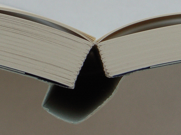
I’ve looked at a whole range of publications and a binding technique that stood out was the so-called Schweizer Broschur (Swiss brochure). With this technique the content pages are only attached to one side of the cover. If combined with a more expensive stitch-binding technique – a series of threads literally stitching the pages together – the Schweizer Broschur can deliver one of the best reading experiences out there. It’s also great from an editorial design perspective: because it lies completely flat I can work with the full area of each spread without the centre being swallowed up.
I can certainly understand why the exposed spine looks ‘unfinished’ to some, but it’s one of those classic ‘form follows function’ cases. The experience it provides makes up for the slightly unrefined look. Once you open the magazine and explore its contents I think you’ll notice how nice it is to be able to do so without requiring any effort at all. Eating your lunch while reading Offscreen has never been easier. 😉