Dear Kai,
Thanks for the speedy delivery of the three issues of Offscreen. I’ve just finished issue 14, now going through 13 and I already feel thankful for what they have done for me. It immediately convinced me to subscribe.
I started out as a graphic designer with a ‘focus on web’ 18 years ago, and then worked at a design agency, before becoming an entrepreneur 10 years ago. I’ve grown up along with the web – learning new tools and new ways of thinking, and incorporating it all into what I offer my clients.
Along the way I’ve lost my interest in design-focused magazines. More recently, I have been on the lookout for something that was more in line with my point of view, something that would enrich my thinking as an entrepreneur. And Offscreen is the perfect fit. The human perspective, the background stories with all the ups and downs really motivate me to continue chasing my dream to create products that help and inspire others.
Thank you very much for that!
Sincerely,
Dirkjan
Letter to the editor
Building a custom magazine subscription management system
This post is an edited version of an email from September 2016 that was part of my Rebranding Diary. You can see much of what I discussed in that email live on our website now, like our multi-tier subscription model that charges readers on a per-issue basis.
Offscreen’s original order management system (OMS) has served me very well over the years. It solved a fundamental problem every magazine maker faces: managing orders for single issues and for subscriptions (which are essentially orders for future issues) in one place, while keeping customer data up-to-date and optimising orders for shipping. It connected directly with PayPal’s IPN system, which has its flaws (like everything PayPal-related) but is extremely easy and fairly flexible to run.
When we created this system almost five years ago, there were a lot fewer out-of-the-box ecommerce tools available. Today, between Shopify, Squarespace, bigCartel, and a whole host of other shopping cart apps, it begs the question why I should develop my own customer and inventory management tool.
Why not go with Shopify?
While the above mentioned apps are extremely powerful (especially Shopify with its own app store), they don’t exactly suit indie magazine makers who often publish new issues infrequently and rely heavily on subscribers to manage their cashflow. Available subscription management plugins don’t cater for this type of product either. Most subscription SaaS products either focus on digital subscription management or sell monthly subscription boxes which are completely different beasts to printed publications that come out every few months. While customising these tools is possible, they are just not meant to be used that way.
I also don’t use any of the larger fulfilment services like Shipstation or Shipwire because Offscreen is shipped through a small logistics company in Berlin. Their low handling fees combined with German Post’s low postage makes shipping Offscreen around the world possible. Going through a small service provider like that also means I don’t have any fancy APIs to work with – instead I export a weekly order sheet in the form of a CSV file and make it available to my shipper in Berlin.
When it comes to handling payments, almost none of the existing apps offer recurring, but infrequent charges. Like many other indie magazines, Offscreen doesn’t adhere to a very strict publishing cycle. I aim for a new issue every four months, but it sometimes varies by a few weeks. Many of the available SaaS products offer recurring charges such as every week, month, quarter or year, but I still haven’t come across a tool that allows me to charge customers whenever I'm ready to ship a new issue. Essentially, I’d like to store my customers’ payment information securely and then trigger a charge by the time I release a new issue.
All of this means that creating a custom plugin for Shopify would be almost as complicated and expensive as creating my own order/subscription management system. And so I chose to go with the latter because it gives me a lot more flexibility.
The ideal order and subscription management tool
So what would the ideal buying experience for readers and the ideal order management system for a publisher look like? I've been pondering that question for the last few months, if not years. Here are some of the features I’d love to use:
-
Make magazine subscriptions more like digital SaaS subscriptions
Most indie magazine subscriptions are simple pre-orders for the next n issues, paid a year in advance. They usually don’t auto-renew which means readers have to be reminded to come back to the site to buy another one-year subscription. Rather than making a big commitment upfront, what if we let readers subscribe on a per-issue basis? Once subscribed, Offscreen charges readers a few weeks before the new issue is released. They can cancel or change tiers any time. -
Offer different tiers of support
So many of my readers want to support the magazine beyond just buying a copy. What if, rather than just buying a standard subscription, they could choose from a few different tiers according to the level of support they want to give? I can imagine at least three different tiers – subscriber, supporter, and patron. The higher tiers include a little gift to show my appreciation for their support. Subscribers can change tiers in between issues. -
Integrate the patron model into subscriptions
Offscreen patrons pay a fee to have their name included as supporters in the back of each issue. I think all small indie publications should consider having such a patronage model for their most loyal readers. Their extra contribution goes a long way in making it a sustainable publishing business. Ideally that patron model would be more deeply integrated in the checkout process so that more people can become a patron without me manually handling every single request. -
Provide a simple account interface to manage orders/subscriptions
I think a lot of us don’t like buying subscriptions to physical products because there is often no sense of control. You subscribe to a magazine online, pay the yearly fee, and then hope that you don’t move houses in the next twelve months. How do I change my shipping address in between issues? Do I need to renew manually? What if my credit card expires? I want Offscreen readers to feel like they are in control of their subscription through a simple account interface – ideally without having to create a login/password. -
Offer discounts to students and libraries
I feel strongly about supporting the next generation of techies and making Offscreen available through more public libraries. Offering EDU discounts isn’t as straightforward as it seems because it requires some sort of eligibility check during the checkout process. We’re exploring using this openly available database to check customers’ email addresses and apply an EDU discount of around 25%. (Note: we didn’t manage to release this feature with our launch, but it’s still on our to-do list.) -
Streamline the management of all of the above
The only reason why I’m able to run Offscreen by myself is that I streamline the admin side of things as much as possible. The ideal system is perfectly tuned to what I need to get done every day, week, month, and quarter. Creating a completely customised system allows me to avoid unnecessary steps and optimises the process between receiving an order and sending out issues.
Some of the above features are ‘experimental’ to say the least. Other publishers I spoke to said I should continue offering standard yearly subscriptions (and this new system still allows me to do that if I change my mind), but I’m eager to see whether the age-old model of magazine subscriptions can be improved through a per-issue model that behaves more like other digital subscriptions we already have.
Using Bootstrap, I quickly created all the necessary templates for the back-end so that my developer Dan Rowden can get started with development. I also spent a lot of time on a very detailed document (23 pages in Google Docs and counting) to outline all the different features, edge cases, etc. It’s been an interesting experience working through every detail of such a big project. There is so much stuff happening behind the scenes that is necessary for things to run smoothly but that nobody will ever see or even know exists.
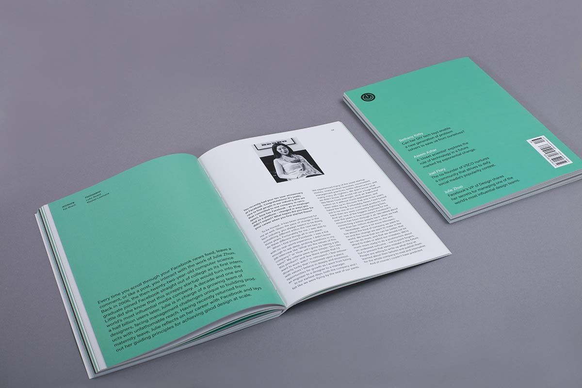
Stitch binding for easy reading
After a few readers asked me whether the binding of the new issue looks ‘unfinished’ on purpose, here some more background on our new, premium binding technique.
All previous issues of Offscreen use a pretty standard binding method called ‘perfect binding’. Tightly wrapped by the cover material, a thin layer of glue holds the content pages in place. ‘Perfect binding’ is not the cheapest method but it’s proven reliable and fairly straight-forward during production which is why it has become a quasi-standard for most publications.
Because the glued spine is quite rigid and usually doesn’t bend open (although you can break it if you force it) some information is lost in the centre of the spread. Depending on other factors, like the paper type, the page count, and the publication’s dimensions, it can be difficult to keep the publication open. This video by Works That Work illustrates this really well.
As you would expect, Germans have a wonderfully descriptive word for this: Klammerwirkung (the peg effect). If you own older issues of Offscreen – in particular issues 5 and 6 – you would have experienced it yourself. At the time, I changed the paper to a heavier stock which increased the Klammerwirkung and gave your hands/fingers a real workout while reading.
There are a few ways around this problem. The early issue of Works That Work in the video above uses a simple saddle-stitch binding (staples) which works well up to a certain number of pages. Then there is a fairly new binding method called Otabind which Works That Work used in later issues as the page count increased. This technique tackles some of the issues above by detaching the cover from the spine. However, depending on the total number of pages and the cover material, it can make the spine of the cover a bit wiggly and flimsy.
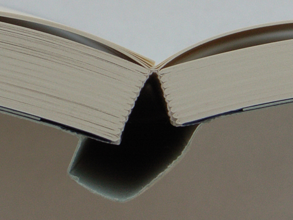
I’ve looked at a whole range of publications and a binding technique that stood out was the so-called Schweizer Broschur (Swiss brochure). With this technique the content pages are only attached to one side of the cover. If combined with a more expensive stitch-binding technique – a series of threads literally stitching the pages together – the Schweizer Broschur can deliver one of the best reading experiences out there. It’s also great from an editorial design perspective: because it lies completely flat I can work with the full area of each spread without the centre being swallowed up.
I can certainly understand why the exposed spine looks ‘unfinished’ to some, but it’s one of those classic ‘form follows function’ cases. The experience it provides makes up for the slightly unrefined look. Once you open the magazine and explore its contents I think you’ll notice how nice it is to be able to do so without requiring any effort at all. Eating your lunch while reading Offscreen has never been easier. 😉
Settling on Acumin, Offscreen’s new typeface
Over the next few weeks I’ll be sharing a selection of my Rebranding Diary emails. These emails went out to backers of my fundraiser every Sunday between August 2016 and March 2017. I’ve made some updates to these emails to adapt them to the blog’s open format. First up: my decision-making process for settling on Offscreen’s new typeface, Acumin. First published on Sep 10th 2016.
Going through the editorial design inspiration that I’ve been collecting for a couple of years now, you can see that I like mainly type-driven spreads, using only a few simple elements combined with one or two (often subdued) colours. This is where the redesign of Offscreen is headed. The goal is to further reduce and simplify, to create a placid reading experience accompanied by unpolished, real-life photography. I want it to feel as calm as reading a book and as personal and authentic as going through someone’s photo album.
How can a typeface assist in that goal?
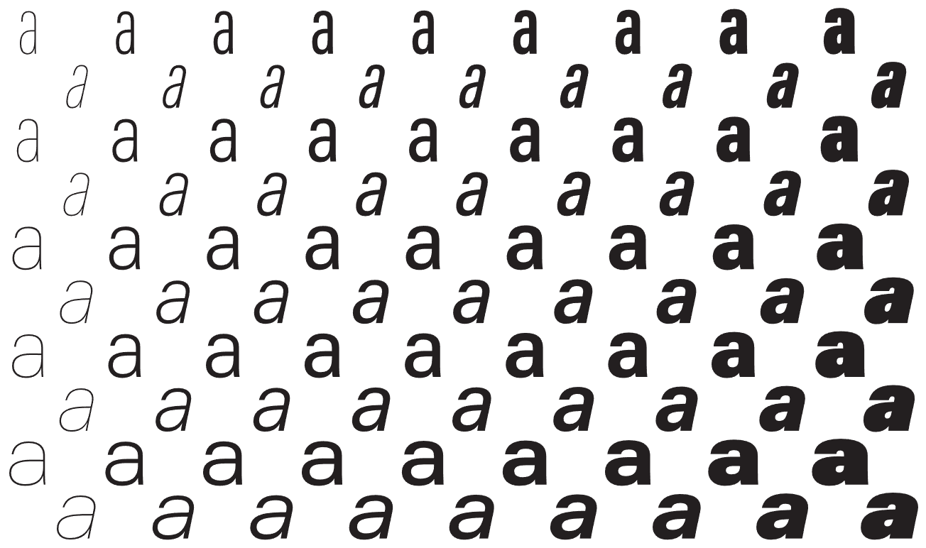
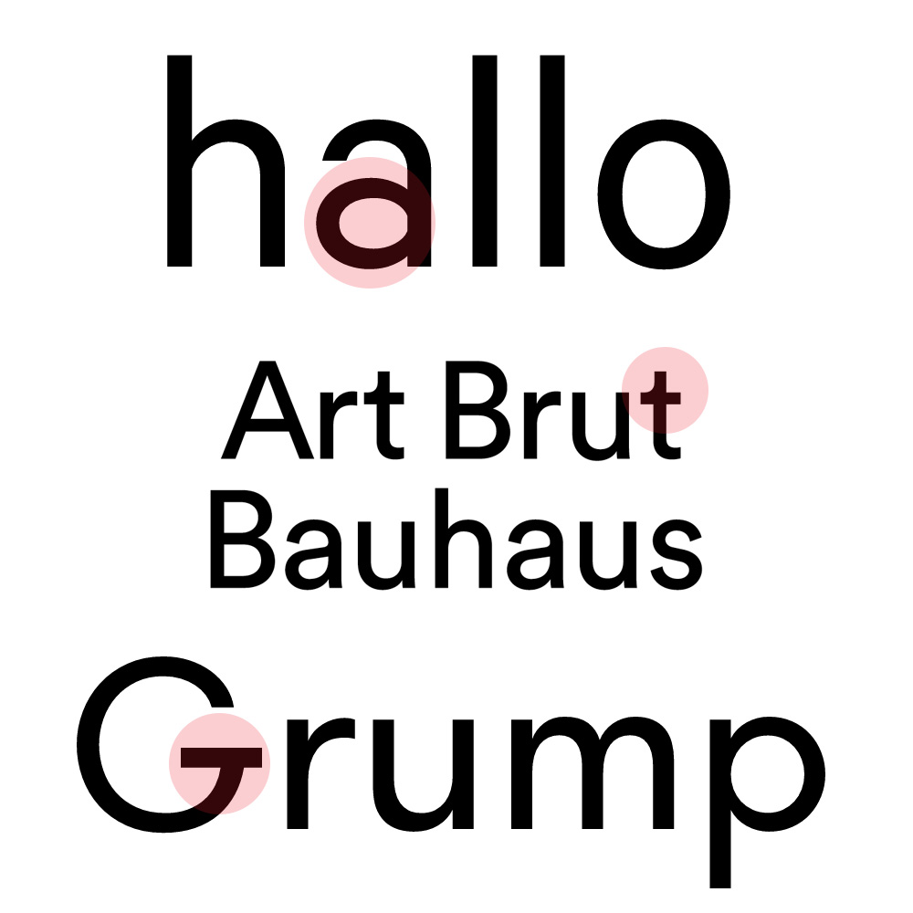
Most typefaces contain a few distinct letters that give it away quite quickly. For example, the unique shape if the lowercase ‘a’ in Calibre, the curve in Circular’s lowercase ‘t’ or that prominent crossbar of Walsheim’s capital ‘G’.
Perhaps that’s why, when I came across Acumin, it didn’t trigger any particular reaction at first. In a way, Acumin is spectacularly unspectacular. It’s a pretty ‘straight-faced’ sans-serif type with few characteristics that stand out. It doesn’t really make much of an effort to grab your attention or sell itself. [Writing this I’m realising that I’m kind of describing myself/Offscreen.]
I love going through the websites of type foundries to explore the stupendous amount of work that goes into designing typefaces. When I buy new things I’m usually rooting for the underdog, so I was eager to support smaller foundries. Acumin was commissioned by Adobe, another reason why I didn’t really pay much attention to it. Not that I dislike Adobe in any way, but as a tiny brand I know that every paying customer can make a big difference. And so after a lot of research, these were the typefaces I set out to test:
- Post Grotesk by Incubator
- Atlas by Commercial Type
- Graphik by Commercial Type
- Lab Grotesque by Stockholm Design Lab
- Neutral by Typotheque
- Founders Grotesk by Klim
- Maison Neue by Milieu Grotesque
- Suisse by Swiss
- Agipo by RP
- RM Pro by The Designers Foundry
- Zurich by bitstream
- Theinhardt by Optimo
- Aktiv Grotesk bu Dalton Maag
- Unica by Linotype
- Neue Haas Grotesk by Linotype
- Acumin by Adobe
On my initial shortlist was Suisse International, Aktiv Grotesk, Atlas, and Post Grotesk. Some testing showed that Suisse and Aktiv Grotesk just ran a little too wide in body sizes. This meant that I either had to cut down on content, reduce the font size or add more pages – neither of which was an easy thing to do. Both of those typefaces can feel a bit too modern and cold. In contrast, Atlas and Post Grotesk are beautifully human and amiable, yet I simply didn’t enjoy them as text fonts. What makes them so friendly and a bit quirky gets in the way when reading long passages of texts, in my opinion.
Once I ruled out the ‘too cool’ and ‘too playful’ types, I was left with something in the middle, something quite neutral. I was looking for a less ‘trendy’ and overused version of Helvetica. This eventually led me to Neutral (duh!) and back to Acumin. Neutral is amazing, but Acumin’s much larger family was very appealing.
After devouring Acumin's wonderful microsite, I did a bit more digging and came across a post by a familiar face. Jeffrey Zeldman has high praise for Acumin. He calls it “a Helvetica for readers”. And I couldn’t agree more with his observations:
Reading about the design challenges Slimbach set himself (and met) helps you appreciate this new type system, whose virtues are initially all too easy to overlook, because Acumin so successfully avoids bringing a personality to the table. Enjoying Acumin is like developing a taste for exceptionally good water. (...)
Book designers have long had access to great serif fonts dripping with character that were ideal for setting long passages of text. Now they have a well-made sans serif that’s as sturdy yet self-effacing as a waiter at a great restaurant."
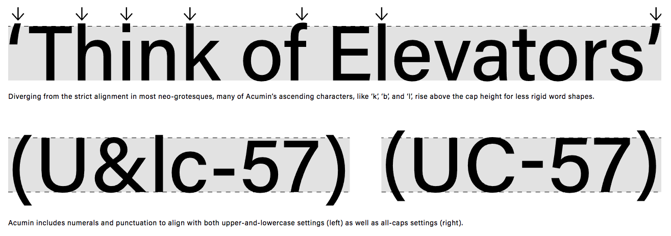
After I ran several rounds of test prints, it impressed more and more. Offscreen is a very small, book-ish magazine, so the typeface has to perform in relatively small, compact spaces. Acumin scales beautifully, no matter the font size. Since I’m an Adobe Typekit user it was easy to test Acumin’s webfonts extensively too, and again, it performed amazingly well on screen.
The microsite claims that Acumin was “developed with the highest standards for aesthetic value, technical quality, and typographic functionality”. That may sound like some cliché marketing speak but I have to admit that there is a certain level of quality in fonts made by big foundries like Adobe or Monotype. Several other fonts I tested had kerning issues at certain sizes or the performance on screen felt more like an afterthought (which is often the case when custom fonts become retail fonts).
What’s also nice about Acumin is that it hasn’t become a the go-to typeface for every new magazine or startup yet. I tend to come across the same ten typefaces in so many magazines and websites these days, but Acumin hardly ever makes an appearance.
So, there you have it. As I’m writing this I’m pretty set on Acumin. As with everything though, I might still change my mind (the advantage of not having to report back to anyone other than you lovely people), but given how much time I’ve spent testing this typeface in various scenarios I can’t see myself doing that all over again with another typeface in the foreseeable future. Having said that, I fall in and out of love with typefaces fairly quickly. 🙃
Since there are a few type designers amongst the readers of this newsletter I should say that I certainly don’t consider myself a type expert. I love discovering the technical details of how a typeface came to be, but in the end I arrive at my decisions to use a particular typeface mostly by ‘what feels good’, and my gut agrees with Acumin.
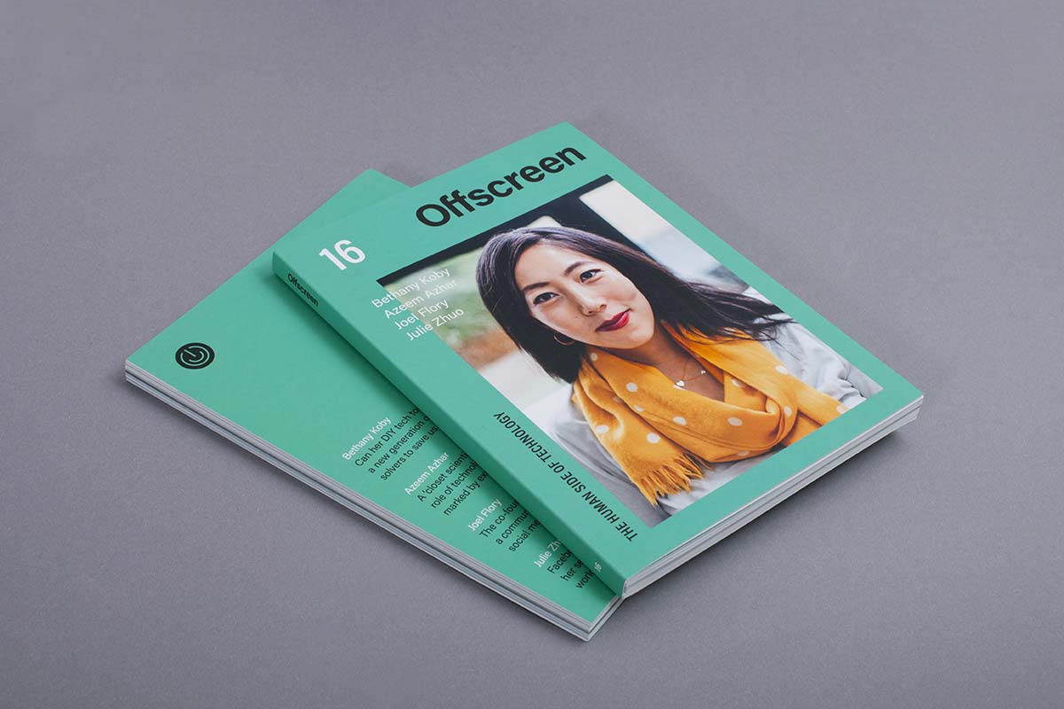
Welcome to the new Offscreen

After some delay I’m beyond excited to finally present the new Offscreen. Some of you have received a glimpse of the revamp through my weekly rebranding updates, but for most of you this is the big reveal. I hope that in the coming weeks I’ll find time to write about some of the many changes. As with any launch, there are still lots of bugs to fix and loose ends to tie up. So for now, let me briefly list some of the many new things we’re launching today:
New look
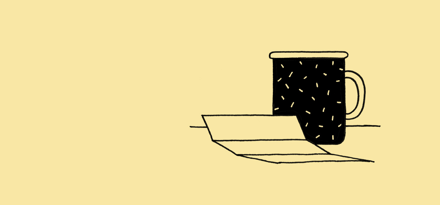
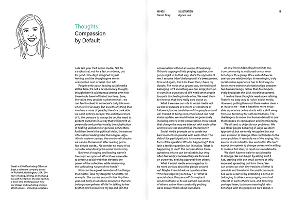
Both the website and the magazine have undergone a complete visual overhaul. The new design comes with a lighter footprint, thanks to simplified typography (just one type family), more white space, a brighter colour scheme, and quirky, hand-drawn illustrations by Agnes Lee that add a personal touch.
New magazine specs
We made the new issue a little smaller so it feels even more like a book. Instead of the standard Perfect Binding that makes the magazine hard to keep open, Offscreen now has an open, lay-flat stitch binding that offers an improved reading experience. We’ve also broken an (unwritten) rule of indie magazine publishing and moved to a matte-coated but still 100% recycled paper for a sharper print result.
New subscription model
The biggest and most complex update is our new subscription model. Subscribing to Offscreen now means you pay for the next issue upfront and for every following issue we’ll simply charge your credit card a few weeks prior to release. It's a set and forget system. You can choose between several tiers depending on the level of support you feel comfortable with. Of course you can cancel your subscription any time through your new Offscreen account (see below). Creating the platform that powers recurring, irregular, multi-tier subscriptions was a bigger challenge than I thought and I will definitely do a more in-depth write-up here in the future. (Thanks to Dan for providing the developer chops to make this happen!)
New Offscreen accounts
To make managing your orders and your subscriptions as easy as possible we built a password-free account interface. After placing an order you’ll receive a link via email that gives you instant access to manage everything Offscreen related: view the status of all existing orders, print invoices, change shipping/billing addresses, cancel or change your subscription, etc.
New weekly newsletter
For more than two years I’ve been publishing a weekly newsletter called The Modern Desk. As part of this rebrand I’ve decided to merge the newsletter with Offscreen. The Offscreen Dispatch is the more frequent, digital counterpart to Offscreen Magazine. For a brief weekly digest of interesting apps, accessories, and articles sign up here.
New website backend
While the old website was mostly a bunch of static PHP files, the new site is powered by Kirby which has been a delight to set up and use. Shout-out to Kirby maker Bastian Allgeier who’s helped with implementing the site with our backend.
There are many other important updates that aren’t directly visible from the outside. And there are some that haven’t yet made it into this first version of the new Offscreen (such as educational discounts). As mentioned above, I’ll try to write up more detailed posts about some of these changes once things have settled down a bit.
With all these changes to the website, don't forget to check out (and order) the new issue! We have a fantastic mix of interviewees in this issue discussing a wide range of topics – from inspiring kids with a new generation of DIY tech toys to how we can prepare for a future marked by exponential change.
This revamp (of website and magazine) has been a huge undertaking. I have to admit that there were numerous moments when I contemplated not seeing it through to the end. Finally revealing everything to the public comes with a big sense of relief but also some trepidation as to whether this big investment of time and money will pay off.
Please enjoy having a look around. If you find bugs we missed (which I'm sure some of you will), please don’t hesitate to let us know so we can continue to improve Offscreen’s online experience.
I’m eager to see what you all think of the new issue and the refreshed format. As always, any supportive tweets, blog posts, Instagrams or real-life word-of-mouth is hugely appreciated! If you have any questions, please email away. It may take me a few days to reply, though. Enjoy!
A big thank you to the following people who helped make this issue and the new website happen: all contributors, sponsors and patrons of issue 16, Dan Rowden, Bastian Allgeier, Agnes Lee, Ivana McConnell, Kieran O’Hare, Michelle F., all beta testers, all backers of my fundraiser, my printer and shipper, and everyone else who supported me in spirit and by sending positive vibes via email, tweet, or postcard.